React Components in Power Apps Code Apps
Learn how React components work in Power Apps Code Apps, including props, state, events, reusable UI patterns, data binding, accessibility, and project structure.
- Published
- Reading time
- 6 min read
Before you start
Is this guide for you?
- Best entry point
- Power Apps
- Time investment
- 6 min read
In this article
- What are React components in Power Apps Code Apps?
- Why React components matter
- React component basics for beginners
- Recommended component structure
- Example reusable React component
On this page (28 sections)
React components are the building blocks of a Power Apps Code app. Instead of putting every button, form, list, card, and status message inside one large screen file, you split the UI into reusable pieces that are easier to understand and maintain.
This beginner-friendly guide explains how React components work in Power Apps Code Apps, how props, state, events, and rendering fit together, and how to organize components for clean Power Platform apps.
If you are new to this topic, also read Power Apps Code, Create Your First Power Apps Code App with PAC CLI, and Connect Power Apps Code Apps to Azure SQL.
What are React components in Power Apps Code Apps?
A React component is a reusable part of the user interface. It can be a small control, such as a button, or a larger section, such as a request form, dashboard card, table, approval panel, or details screen.
In a Power Apps Code App, React components help you build a code-first app experience while still connecting to Power Platform data, services, and business processes.
Why React components matter
Components matter because app screens can become difficult to manage when all layout, data, validation, and event handling are kept in one file. Breaking the screen into focused components makes the app easier to improve over time.
- Reuse. Build one component and use it across multiple screens.
- Consistency. Keep forms, cards, lists, and messages looking the same.
- Maintainability. Update one component instead of editing repeated code.
- Testing. Validate small parts of the UI without reviewing a full app screen.
- Accessibility. Apply labels, keyboard behavior, and states consistently.
React component basics for beginners
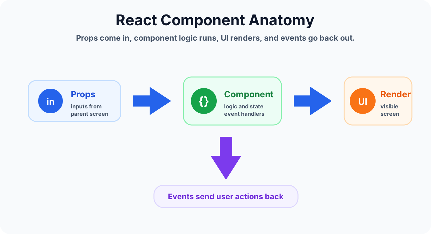
Most components follow a simple pattern: they receive data, display UI, respond to user actions, and tell the parent screen what happened.
Props
Props are values passed into a component. They make a component reusable because the same component can display different data in different places.
State
State is data the component manages while the user interacts with it. Use state for temporary UI behavior such as selected tabs, open dialogs, form input, loading states, and validation messages.
Events
Events happen when the user clicks, types, selects, submits, or changes something. A good component handles the UI event and passes the meaningful action back to the parent screen.
Rendering
Rendering is how the component turns data and state into visible HTML. Clean components keep rendering predictable and avoid hidden side effects.
Recommended component structure
A simple folder structure keeps Power Apps Code projects easier to scan. Use components for reusable UI, hooks for shared behavior, services for data access, and utilities for formatting or validation.
src/
  components/
    RequestCard/
      RequestCard.tsx
      RequestCard.module.css
  hooks/
  pages/
  services/
  utils/
Example reusable React component
This small example shows a status card component. It receives values through props and raises an event when the user opens the request.
type StatusCardProps = {
  title: string;
  status: 'Draft' | 'Submitted' | 'Approved' | 'Rejected';
  onOpen: () => void;
};

export function StatusCard({ title, status, onOpen }: StatusCardProps) {
  return (
    <article className="statusCard">
      <h3>{title}</h3>
      <p>Status: {status}</p>
      <button type="button" onClick={onOpen}>
        Open request
      </button>
    </article>
  );
}
Working with data and services
React components should not directly contain every data rule. For cleaner Power Apps Code architecture, pass data into components and keep shared data operations in services, hooks, or helper functions.
For example, a screen can load request data from Dataverse, Azure SQL, or another service, then pass that data into a reusable card, table, or form component. The component focuses on the UI. The service focuses on the data.
Common React component use cases
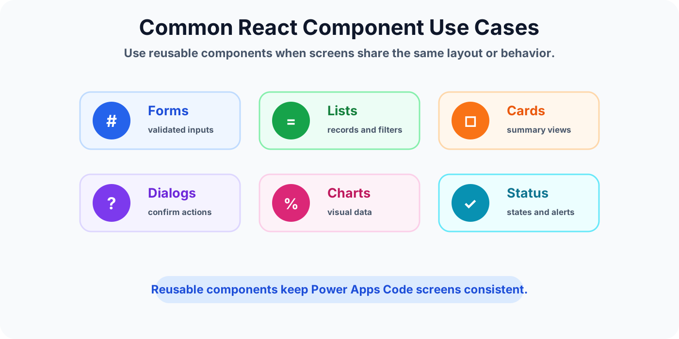
Use components when screens share the same layout or behavior. Reusable components are especially helpful for enterprise apps where consistency matters across teams and regions.
Forms and validation
Use form components for repeated input patterns such as employee requests, approvals, expense entries, onboarding tasks, and support tickets.
Lists and tables
Use list or table components when multiple screens show records with sorting, filtering, status badges, or action buttons.
Cards and summaries
Use card components to summarize key information such as request status, owner, due date, priority, or next action.
Dialogs and panels
Use dialog components for confirmation, editing, preview, help text, and short guided actions.
Charts and metrics
Use chart components for dashboards, reporting screens, and operational views where users need to compare data quickly.
Status and notification UI
Use status components for loading, empty states, errors, success messages, and permission warnings.
Accessibility and UX checklist
- Use semantic HTML such as buttons, forms, labels, headings, and lists.
- Make interactive controls reachable with the keyboard.
- Use clear button text, not vague labels.
- Show loading, success, error, and empty states.
- Keep text readable on mobile and desktop screens.
- Use alt text for meaningful images.
Best practices for React components in Power Apps Code
- Keep components focused. A component should have one clear UI responsibility.
- Name props clearly. Use names that explain what the component needs.
- Separate shared logic. Move reusable business rules into hooks, services, or utilities.
- Avoid duplicate UI. If the same card or form appears twice, consider a reusable component.
- Design for change. Enterprise apps often grow, so keep components easy to extend.
Mistakes to avoid
- Putting every screen, component, and data call into one large file.
- Passing too many unrelated props into one component.
- Mixing UI rendering with complex business rules.
- Forgetting loading, error, and empty states.
- Building components that only work for one hard-coded record.
How this fits in the Power Apps Code learning path
React components are one part of a larger Power Apps Code app architecture. Learn the basics first, then connect your UI to real data and business logic.
- Understand the Power Apps Code model.
- Create a basic app with PAC CLI.
- Build reusable React components for forms, cards, and lists.
- Connect the app to data such as Azure SQL.
- Improve accessibility, performance, and maintainability before rollout.
Frequently asked questions
What is a React component in Power Apps Code Apps?
A React component is a reusable UI block that receives data through props, manages local behavior with state, handles user events, and renders part of the app screen.
Why should I split a Power Apps Code app into components?
Components keep screens easier to maintain, test, and reuse. They reduce repeated UI code and make forms, lists, cards, dialogs, and status messages more consistent.
Should business logic live inside React components?
Keep UI-specific behavior in components, but move reusable business rules, data access, validation, and formatting into helpers, hooks, or service modules when the logic is shared.
How do React components connect to data in a Power Apps Code app?
Components usually receive data from parent screens, hooks, generated service clients, or app state. The component should render the data and raise events when the user takes action.
What makes a React component production ready?
Use clear props, readable names, accessible labels, predictable states, error handling, loading states, and focused responsibilities.
Summary
React components help Power Apps Code Apps stay organized as they grow. Use components for reusable UI, pass data through props, manage temporary UI behavior with state, handle events clearly, and keep shared logic outside the component when it belongs to the wider app.
Tagged
React · PAC CLI · Project Structure · Vite
Frequently asked questions
What is a React component in Power Apps Code Apps?
A React component is a reusable UI block that receives data through props, manages local behavior with state, handles user events, and renders part of the app screen.
Why should I split a Power Apps Code app into components?
Components keep screens easier to maintain, test, and reuse. They reduce repeated UI code and make forms, lists, cards, dialogs, and status messages more consistent.
Should business logic live inside React components?
Keep UI-specific behavior in components, but move reusable business rules, data access, validation, and formatting into helpers, hooks, or service modules when the logic is shared.
How do React components connect to data in a Power Apps Code app?
Components usually receive data from parent screens, hooks, generated service clients, or app state. The component should render the data and raise events when the user takes action.
What makes a React component production ready?
Use clear props, readable names, accessible labels, predictable states, error handling, loading states, and focused responsibilities.
Sources
- Microsoft Learn: Code Apps, Microsoft
- Microsoft Learn: Power Apps, Microsoft
Have a Microsoft 365 topic idea?
Share article suggestions, community session ideas, corrections, or real-world scenarios for future nextM365 learning notes.
Keep learning Microsoft 365
Explore more practical guides for SharePoint, Power Platform, Copilot Studio, migration, automation, governance, and security.
Continue learning
Related tutorials
Related questions
Related comparisons
Next action